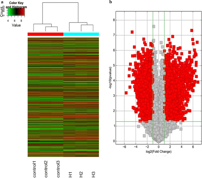
Fig. 2.
The heat map of the differentially expressed gene and the volcano plot of visualizing differential expression variation between syphilis combined with diabetes and controls. a The data are depicted as a data matrix, in which red represents high relative expression and green represents low relative expression. b The vertical lines correspond to 2.0-fold up and down, respectively, and the horizontal line represents a p-value of 0.05. Red point in the plot represents the DEGs with statistical significance

