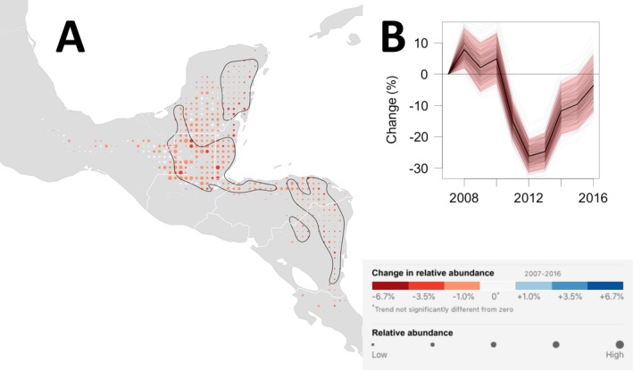
Figure 6.

Wood Thrush non‐breeding trend map and range‐wide population trajectory. (A) The non‐breeding season (1 December–28 February) average annual percentage change in relative abundance from 2007 to 2016. Increases in population size are shown in blue and decreases are shown in red. Darker colors indicate stronger trends. Each dot on the map represents a 25 × 25 km area. To help visualize the relative change in population size at each location, the size of each dot has been scaled according to the average abundance at that location during the 10‐yr study period. Within the regions delineated by the black contour line, the expected false discovery rate (type I error) is up to 5% when identifying locations with increasing and decreasing trends. Outside the black contours, the direction of population change is less certain. The breeding season power analysis suggests that regions within the black contours contain 40% of all locations across the breeding range with non‐zero trends and contain 70% of all trends with trend magnitudes of 6.7% per yr or more (approximately equivalent to halving or doubling of the population across 10 yr). (B) The trajectory shows the range‐wide change in population size standardized as the percent change since 2007. The dark black line is the conditional mean estimate, the red polygon are the 95% confidence limits, and the light gray trajectories show the 500 replicate estimates.
