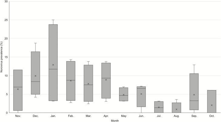
Figure 1.
Box-and-whisker plot of norovirus prevalence by month from stool specimens collected from patients at 4 Veterans Affairs Medical Centers, November 2011–September 2015. Boxes represent the interquartile range by surveillance year; horizontal lines indicate median prevalence; and “X” indicates mean norovirus prevalence for each month.

