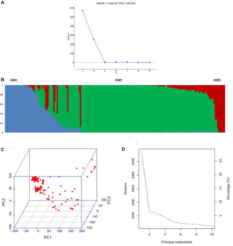
FIGURE 1.
Population structure of the association mapping panel comprising of 192 genotypes analyzed by model based and PCA based approaches. (A) ΔK plot depicting three subgroups in the population by Evanno’s method. The highest ΔK was 580 at K = 3, (B) the bar plot showing the three sub-populations identified. POP2 was the largest and showed remarkable admixture with POP1. POP3 was the smallest group, which showed less admixing with POP1 (C) 3D graph depicting the distribution of accessions along the three PCs (D) scree plot depicting the number of significant PCs. There were three PCs that explained a cumulative variation of ∼40%.

