Fig. 2.

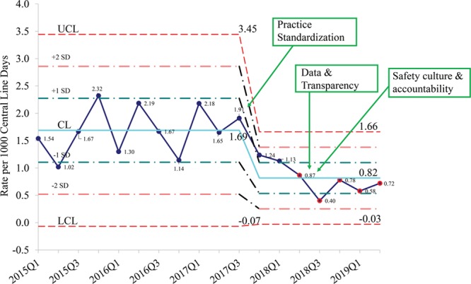
SPC chart with quarterly CLABSI rate per 1,000 central line days for the years 2015–2019 with time-line of interventions for the key drivers. Q indicates quarter; UCL, upper control limit; CL, centerline; LCL, lower control limit.

SPC chart with quarterly CLABSI rate per 1,000 central line days for the years 2015–2019 with time-line of interventions for the key drivers. Q indicates quarter; UCL, upper control limit; CL, centerline; LCL, lower control limit.