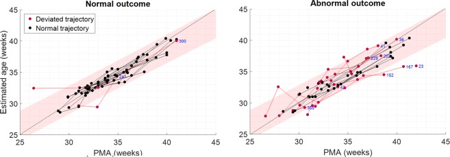
Figure 4.
Illustration of the trajectory plots of for Nf = 226, separated by outcome group. The more deviant trajectories are highlighted by fitting a 95% prediction interval threshold to the normal-outcome data (left plot). The 95% prediction interval is shaded in each plot, with the trajectories highlighted in red when at least one recording exceeded this threshold. The anonymous patient ID is also provided for these cases (in blue). Grey dotted lines show the line for brain-age = PMA.

