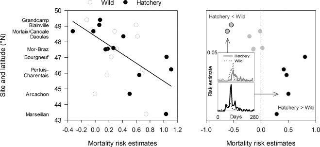
Figure 4.
Mortality risk estimates of wild and hatchery oysters (left) and their differences (right) as a function of latitude or sites. Left panel: mortality risk increased southward for hatchery oysters (black line) but not for wild ones. Right panel: mortality risk was higher for wild than for hatchery oysters in two northern sites (grey circles with black edges), while the opposite was observed in the five southernmost sites (black circles with grey edges). The mortality risks were similar between origins in the middle of the study area (grey circles with no edge). Insets show mortality risk estimates as a function of time for the two northern sites (upper graph) and the five southernmost sites (lower graph).

