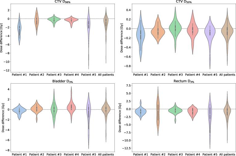
Fig. 3.
Violin plots presenting the difference between the delivered and planned dose, quantified via four dose-volume metrics. The width of each violin is governed by the probability density of the data points. Additionally, small box plots are included in each violin. The box marks the first and third quartile, while the white dot denotes the median. The whiskers represent the 1.5 interquartile range.

