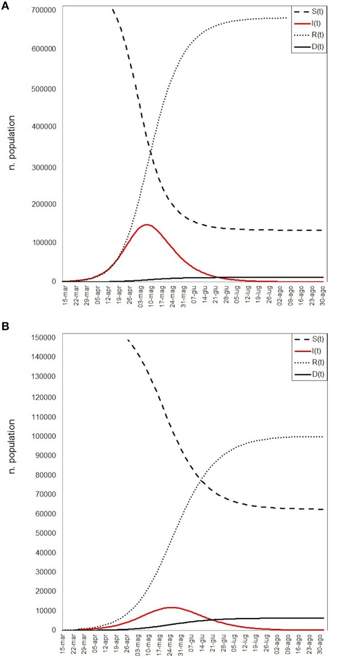
Figure 4.

SIRD models simulation: red line represents the infectious (I), continuous black line the deaths (D), little dashed line the recovered (R), large dashed line the susceptible (S) population. (A) The worst scenario results, (B) the best scenario results.
