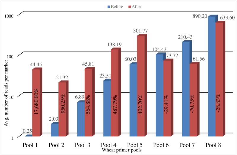
Fig 2. Before and after optimization of wheat primer pools.
Depicts the average number of sequence reads per marker per pool before and after the reconstruction of each primer pool. The X axis shows the eight primer pools and the Y axis represents the number of sequence reads per marker per pool in log scale. Horizontal numbers show the average number of sequence reads generated per marker/sample. Vertical numbers indicate the percent increase or decrease in the average number of sequence reads generated per marker/sample after the primer pools were reconstructed.

