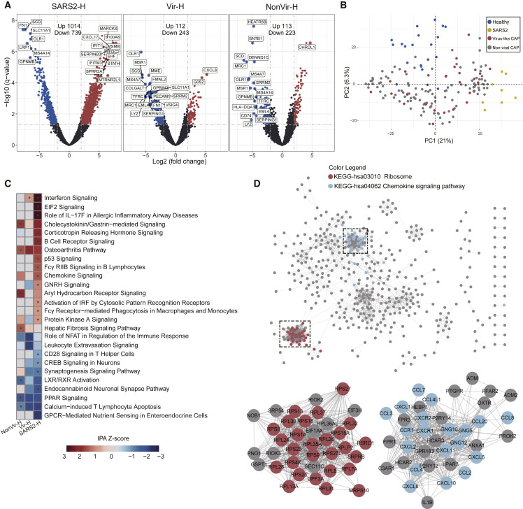
Figure 1.
Analysis of DEGs in BALF of COVID-19 and CAP Patients Compared to Healthy Controls
(A) Volcano plot of DEGs comparing SARS2 versus Healthy (SARS2-H), Virus-like CAP versus Healthy (Vir-H), and Non-viral CAP versus Healthy (NonVir-H). The names of DEGs with the top 20 absolute FC are shown.
(B) PCA loading plot based on all DEGs. Autoscaling of data was performed.
(C) Functional enrichment analysis of DEGs with IPA. Asterisks (∗) indicate q-values < 0.05 and absolute Z score ≥ 1.
(D) PPI network of upregulated DEGs in SARS2 comparing to Healthy. Each node represents a protein, and interactions with confidence score > 0.9 are presented.
See also Figure S2.

