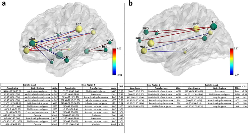
Fig. 15.
The figure illustrates the connectivity paths which have significantly different means between the groups (p<0.05, corrected for multiple comparisons using permutation test) as well as are among the top hundred most discriminative paths in autism brain imaging data exchange (ABIDE) dataset for a binary classification between controls and autism spectrum disorder. b 3-way classification between healthy controls, Asperge’s syndrome and autism. The size of the nodes indicates the relative importance of the region (Table S20). Common nodes between binary and multiclass classification are indicated in yellow while other nodes are indicated in green. The sign of the paths indicates overconnectivity (positive) or under-connectivity (negative) in healthy controls compared to clinical populations. Consequently, red represents a higher connectivity between controls compared to the clinical populations and blue represents a lower connectivity. The numerical values in the color bar denote the combined feature importance score (CFIS) of the path obtained from classification. A higher absolute number indicates more discriminative ability for the functional connectivity path. The table below the figure tabulates the brain regions involved in the paths visualized above along with the abbreviations of the two regions and the CFIS for the connectivity paths

