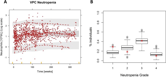
Figure 4.
Evaluation of the myelosuppression model for the absolute neutrophil counts (ANC) of the patients. (A) Prediction-corrected visual predictive check. Solid circles represent observed ANC, solid lines represent the median of the observed data, and dashed lines the 2.5 and 97.5 percentiles of the observations. Shaded areas are the 95% confidence intervals based on the simulated data (n = 1000) for the corresponding percentiles. (B) Percentage of patient in grade 1,2,3 and 4 neutropenia (grade 1: >1.5 ANC, grade 2: 1–1.5 ANC, grade 3: 0.5–1 ANC, grade 4: <0.5 ANC). Boxplots summarize the result of the 500 simulations and the red cross represents the real percentage values from the dataset.

