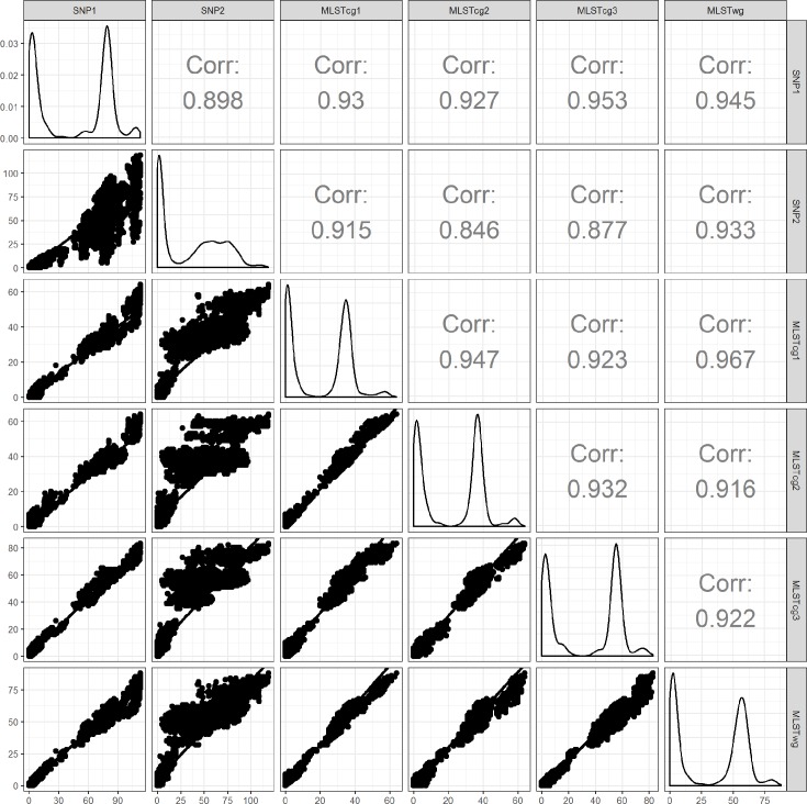
Fig. 2.
Pairwise correlation between the genetic distances of the various workflows. The diagonal shows the density plots of the distances in each of the six workflows. The upper half of the plot indicates the Spearman coefficients of correlation for each combination of distance matrices. In the dotplots, the x-axis represents the genetic distance among isolates, as measured by the workflow indicated on the column label; the y-axis represents the genetic distance among isolates, as measured by the workflow indicated in the row label. Only the distances between isolates that are present in both workflows of a pairwise comparison are depicted in the figure.

