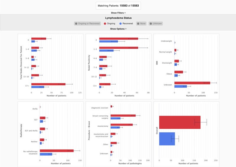
Figure 2.

The final prototype of the cohort data dashboard visualizes data for the group of patients who have been screened for lymphedema and presents it to the user in a single dashboard. The dashboard is interactive and by default displays a comprehensive overview of all the cohort data available to the user. In this figure, the dashboard is showing data for all patients who have been diagnosed with lymphedema (indicated in purple) and all patients that have had a lymphedema index (L-Dex) measure <10 (indicated in green). BMI: body mass index.
