Figure 1.

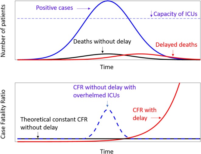
Theoretical models. Above are the frequency curves of positive cases (blue line), deaths (black line), and deaths with a delay with respect to the positive cases (red line). The dotted line represent the capacity of Intensive Care Units, as hypothesized by Anderson et al. (3). Below the relevant values of Case Fality Ratio according to the above distributions.
