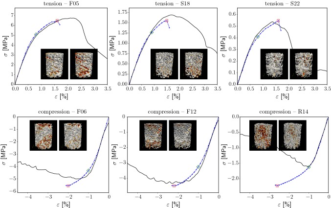
Fig. 4.
Selected stress–strain curves of experiments (black, solid, from Schwiedrzik et al. (2016)) and simulations (blue, dotted). The green and red rectangles mark the apparent 0.2% yield point and the maximum stress point, respectively. For these two points, the local damage pattern is shown (small pictures: bone structure in gray, damage in red)

