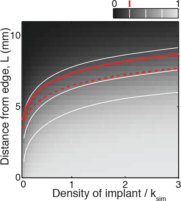
Figure B2:
Comparison between numerical and theoretical results. The color scale represents the simulated score (the ratio f of species 2 density over total population density) at the front of the expansion range, at t = 6 hours after implantation. The secondary species is characterized by D2 = 2D1 and r2 = 0.9r1. The white lines are iso-frequency contour lines for simulated score f = 0.25, 0.5, and 0.75. The red dashed line is the f = 0.25 contour line from equation B12. The red solid line is the f = 0.25 contour line corrected for growth.

