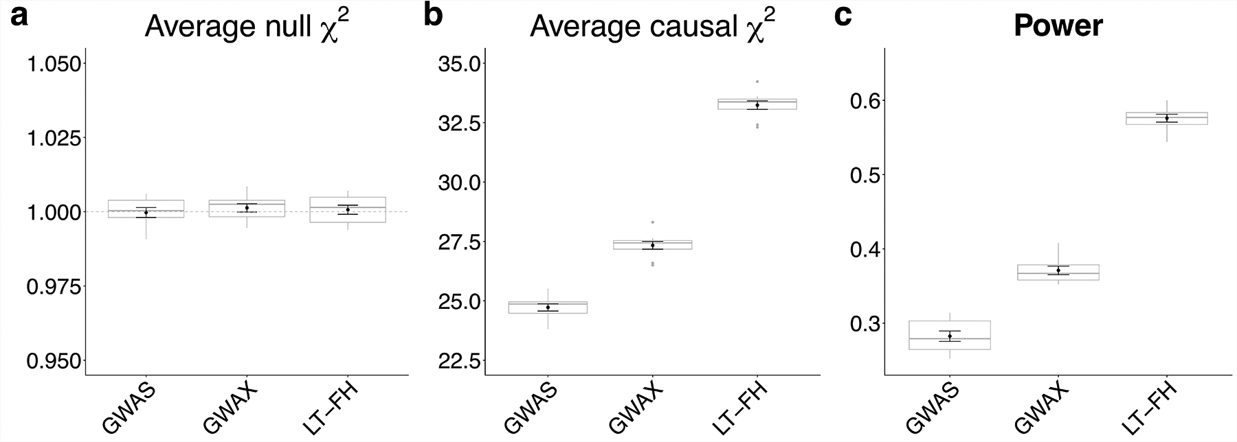
Figure 2: LT-FH is well-calibrated and increases association power in simulations.

(a) Distribution of average χ2 for null SNPs (the dashed grey line shows the expected null value of 1). (b) Distribution of average χ2 for causal SNPs. (c) Distribution of power, defined as the proportion of causal SNPs with p < 5*10−8. Each grey boxplot represents estimates from 10 simulations, each simulation consists of 100,000 SNPs (500 causal SNPs). The center line denotes the median, the lower and upper hinges correspond to first and third quartiles, respectively, whiskers extend to the minimum and maximum estimates located within 1.5 × interquartile range (IQR) from the lower and upper hinge, respectively. Black points and error bars represent the mean and ± 1 standard error of the mean. Numerical results are reported in Supplementary Table 1.
