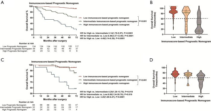
Figure S11.
Kaplan-Meier survival analysis and violin plots of overall survival time according to the immunoscore-based prognostic nomogram. (A) Kaplan-Meier curves for overall survival according to the immunoscore-based prognostic nomogram in the training cohort. (B) The green line is the median overall survival time, and blue dotted lines represent the first and third quartiles of patients’ overall survival time in the training cohort. Violin shape shadows represent the actual distribution of individual immunoscore-based prognostic nomogram subgroups’ overall survival time. (C) Kaplan-Meier curves for overall survival according to the immunoscore-based prognostic nomogram in the external validation cohort. (D) The green line is the median overall survival time, and blue dotted lines represents the first and third quartiles of patients’ overall survival time in the training cohort. Violin shape shadows represent the actual distribution of individual immunoscore-based prognostic nomogram subgroups’ overall survival time.

