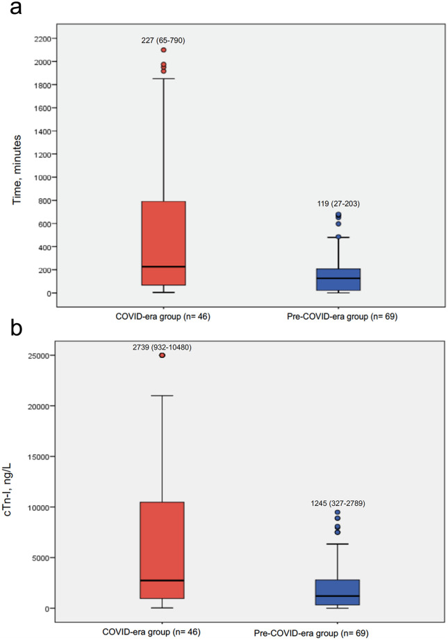
Figure 1.
A, Boxplot graph illustrating the distribution of time delays in minutes for the COVID era and pre-COVID era groups. Boxes represents median and IQRs, while whiskers display the smallest and largest non-outliers. B, Boxplot graph illustrating the distribution of cardiac Tn-I on admission for the COVID era and pre-COVID era groups. Boxes represents median and IQRs, while whiskers display the smallest and largest non-outliers. Tn-I, Cardiac troponin I.

