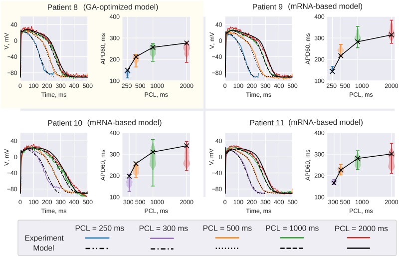
Fig 11. Patient 8 GA output model.
Patient 8 GA-output model (top left corner) comparison with experimental AP recordings. Red, green yellow and blue lines correspond to AP recorded at 2000, 1000, 500 and 250 ms PCL correspondingly. The pixel of recording is shown on APD maps in Fig 10. Model restitution curve (black line) is superimposed on violin plots depicting APD60 distribution in the wedge preparation. Other panels use the same convention to compare Patient 8 model rescaled according to RNA-seq data to Patients 10–12 AP recordings.

