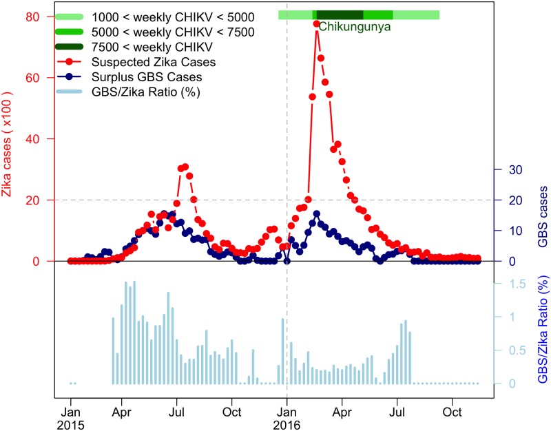
Fig 2. The reported ZIKV cases, excess (or surplus) GBS cases and GBS-to-ZIKV ratio in the NE region of Brazil from January 2015 to November 2016.
The red dotted line represents weekly ZIKV disease cases, the dark blue dotted line represents weekly surplus GBS cases and the light blue bars are GBS-to-ZIKV ratios. The CHIKV outbreak of 2016 is denoted with different shades of green according to number of weekly cases. The GBS-to-ZIKV ratios are not plotted for the initial few weeks as the scale of the ZIKV data is not large enough to compute a meaningful ratio.

