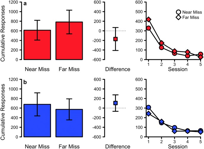
Fig. 2.
The results of Experiment 1a (top) and 1b (bottom). The left-most plot shows the mean cumulative responses during extinction for the near and far miss treatments. The centre plot shows the mean difference between these treatments. All error bars indicate 95% confidence intervals. The right-most plot shows the mean cumulative responses across the five sessions of extinction testing. Circles and diamonds indicate Near Miss and Far Miss extinction treatments respectively

