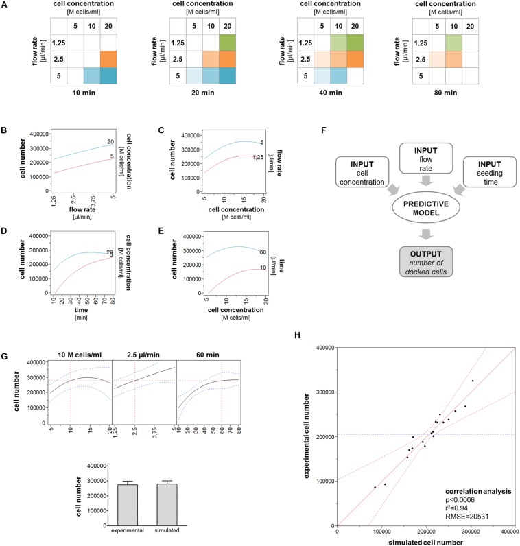
FIGURE 4.
Cell trapping model. (A) All the experimental conditions included in the model are represented as 2D matrices. (B–E) Interaction plots describing the relation between cell concentration and flow rate or seeding time. Lines describe the variation of the number of trapped cells in correspondence of the minimum and maximum values of the variable indicated in the right y-axis for increasing values of the variable indicating in the x-axis. (F) Schematic of the working principle of the predictive model. (G) Comparison between the numbers of trapped cells obtained experimentally and predicted by the model for the following parameters: 10M cells/ml, 2.5 μl/min, 60 min. (H) Correlation plot describing the correlation between the number of trapped cells experimentally measured and the number predicted by the model.

