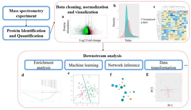
Figure 1.
General workflow of bioinformatics analysis in mass spectrometry-based proteomics. (a) MA-plot from protein differential abundance analysis. X-axis is the log2 transformed fold change and Y-axis is the average protein abundance from replicates. (b) Distribution of protein abundance data before and after normalization. (c) Heatmap for protein abundance with clustering; (d) Protein set enrichment analysis, Y-axis in the above plot shows the ranked list metric, and in the bottom plot shows the running enrichment score. X-axis is the ranked position in protein list. (e) Machine learning-based sample clustering. (f) Illustration of a network inferred from proteomics data. (g) Dimensionality reduction of proteomics expression profile.

