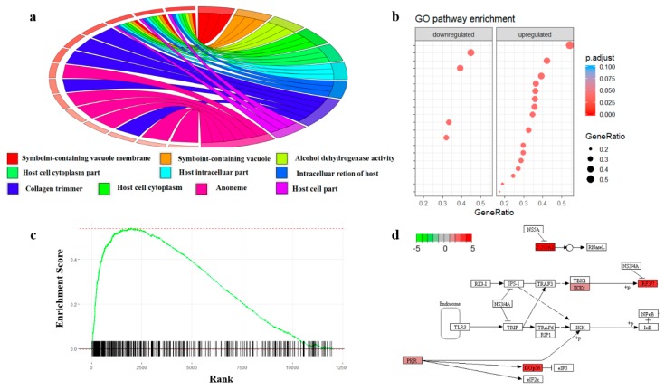
Figure 3.
Illustration of enrichment analysis with proteomics data. (a) Gene Ontology (GO) enrichment with Circos plot. The left part of the circle shows the differentially expressed proteins and their significant levels. The right part shows the enriched GO Terms. (b) Pathway enrichment in dot plot. The colors of the dots represent the adjusted p-value and the sizes of the nodes represents the ratio of the proteins that are differentially expressed to the total proteins in the pathway. (c) The running sum score of the gene set enrichment analysis (GSEA). Significant proteins will increase the enrichment score and proteins that are not in the list will decrease the score. (d) Protein enrichment with KEGG pathway database with Pathview. The color of the boxes represents the log2 fold change of the protein abundances.

