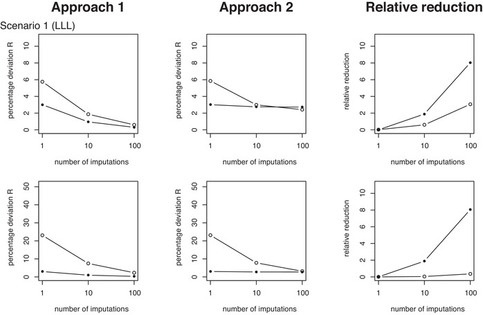
Figure 7.

Measures of average percentage prediction deviations (). The two rows of plots from top to bottom correspond to simulation MCAR Scenarios 1 and 3. The two left columns of plots show results from Approaches 1 and 2 (as also shown in Figures 5 and 6) versus the number of imputations used in the calibration of the predictors. The right‐side column of plots displays the corresponding relative variance reductions for Approach 1 relative to Approach 2. See Table 1 for description of the scenarios. Results for all other scenarios and MAR are found in the supporting information
