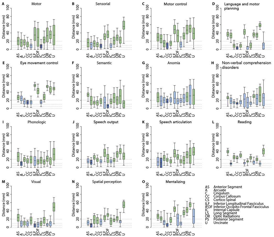
Figure 5.
In panels A-O we report the distributions (mean, 50% and 95% quantiles) of the distance of the different subcortical functional responses from the course of main white matter tracts, as reconstructed in the NatBrainLab Atlas (available at http://www.natbrainlab.co.uk/atlas-maps). In each panel the dark blue box plot represents the tract with minimal mean distance; the light blue box plots represent tracts whose mean distance is not statistically different from the minimal distance (Wilcoxon test; p>0.05); and the green box plots represent tracts whose mean distance is statistically different from the minimal distance (Wilcoxon test; p<0.05).

