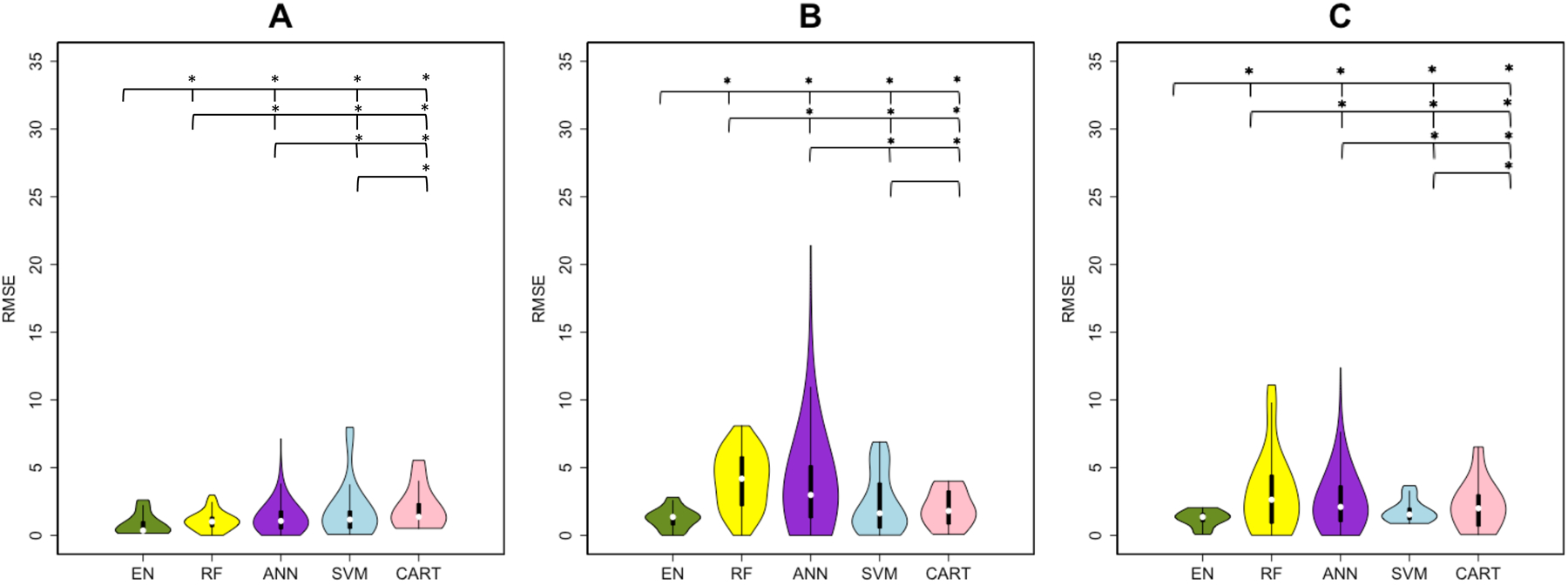
Figure 1. Root of mean squared error (RMSE) results of regression analysis in predicting post-intervention UE-FMA.

Violin plots show the median, 1st and 3rd quartile, minimum and maximum value of the RMSE distribution calculated by five machine learning methods. (Elastic-Net (EN) = green, Random Forest (RF) = yellow, Artificial Neural Network (ANN) = purple, Support Vector Machines (SVM) = blue and Classification And Regression Trees (CART) = pink). The panels represent the RMSE over three sets of input variables (A) clinical, (B) clinical + regional disconnectivity and (C) clinical + pair-wise disconnectivity. A significant difference between the performances of two methods was shown with a star above the violin plots.
