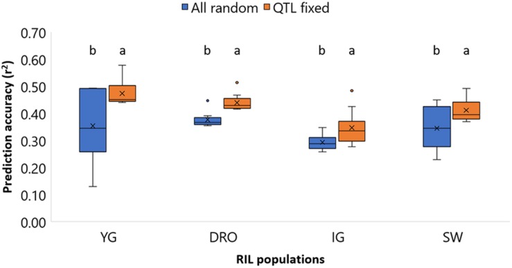
FIGURE 6.
Comparison of the prediction accuracies of grain yield (GY) for the four population YG, DRO, IG, and SW, using a model with all markers considered as random effect against a models that fixed markers underlying QTLs. The horizontal line represents the average, the square indicates the 2nd and 3rd quartiles, the whiskers represent the 1st and 4th quartiles, the cross the median, and the dots are outliers. The letters indicated classes determined via LSD.

