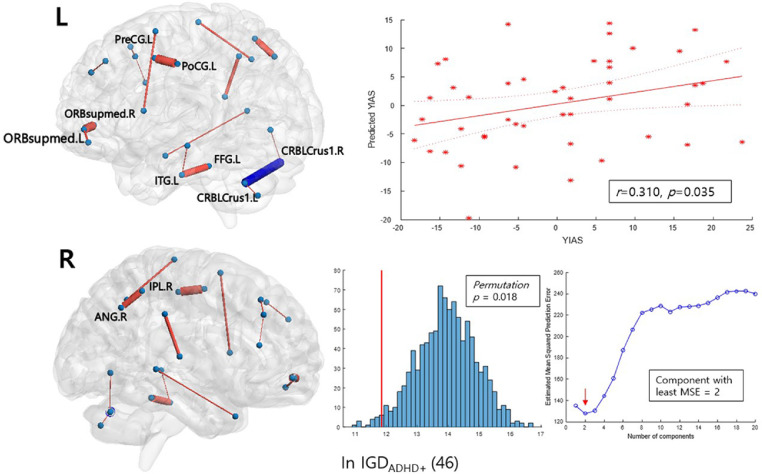
Fig. 3.
Network edges predicting the YIAS score in the sub-network NBS analysis of the ‘ADHD-related’ network. The thickness of the edges corresponds to their mean coefficient in bootstrap resampling; the edges colored in red are those with a positive coefficient, while the blue edges have a negative coefficient. The mean and two standard errors for each edge are plotted in Figure S4C, in the Supplementary Material. L and R indicate the left and right brain sides, respectively. The scatter plots show a correlation between the mean-centered scores of real and the predicted scores from PLS regression and their fitted lines with 95% confidence intervals. The histograms show the performance of the PLSR model tested by comparing the models trained on the shuffled data with 1000 iterations. The red line represents the root mean squared error of prediction (RMSEP) of the original model. For each iteration, the RMSEP between the shuffled score and the predicted score trained on the shuffled data was calculated. The median RMSEP plot obtained from bootstrap LOOCV process denotes the number of the component we chose for the construction of the PLS model. PLS regression predicting the K-ARS-P score within the IGDADHD+ group did not yield a significant model.

