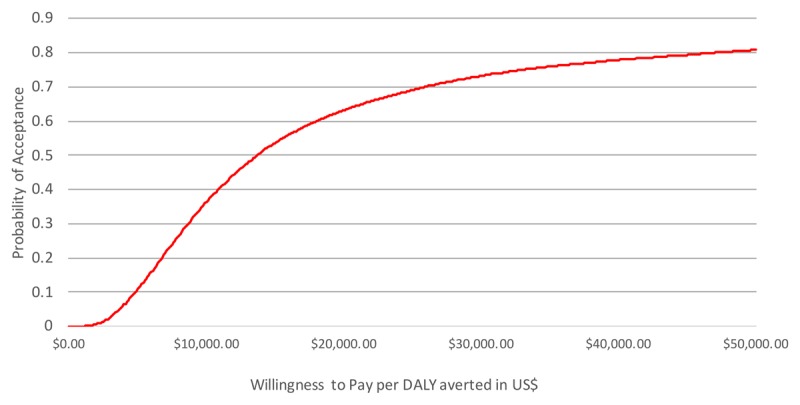
Figure 2.

Cost-effectiveness acceptability curve. The X-axis shows a range of increasing cost-effectiveness thresholds, while the Y-axis shows how high the probability is that the screening intervention is cost-effective against a cost-effectiveness threshold when compared to standard care if variance in the data is taken into account. The line shows how high the probability is that the intervention is accepted against a certain cost-effectiveness threshold, given the uncertainty of the parameter estimates.
