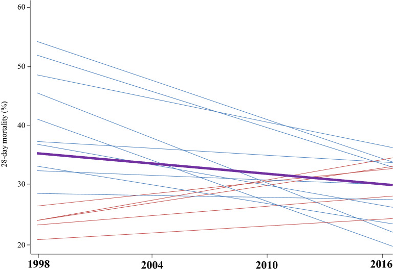
Fig. 2.
Regression lines of the evolution of the 28-day mortality by countries (thin lines) and globally (thick line). For simplicity of the graph, only the fifteen countries that participated in the four studies are shown. Overall 28-day mortality decreased over time (thick line). The variability between countries declined (the dispersion is lower in the last year than in the first year). The rate of change in mortality in each country is inversely related to the initial dispersion: countries farthest from the average changed faster in the opposite direction. Countries with initial higher mortality tended to see this decline more rapidly (blue lines), while those with initial lower mortality tended to raise it slowly (red lines)

