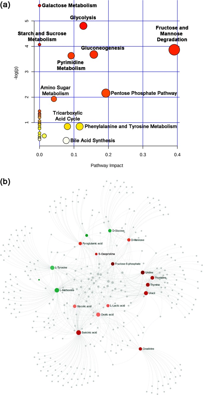
Fig. 4.
Mapping the metabolites to pathways and networks. a Pathway enrichment analysis of the 35 metabolites showing significant changes in the B–I group. Pathways labeled in red contain the highest number of mapped metabolites (P < 0.05). The map was produced by analyzing the metabolites through over-representation analysis with Fisher’s exact test and pathway topology using the murine Small Molecule Pathway Database within MetaboAnalyst. b Metabolite-metabolite interaction network highlighting potential functional relationships among the annotated metabolites. Metabolites in shades of red are those with higher concentration in thermally injured and P. aeruginosa infected mice; those in shades of green are those with lower concentration. All gray circles are metabolites linked to, but not present in, our dataset

