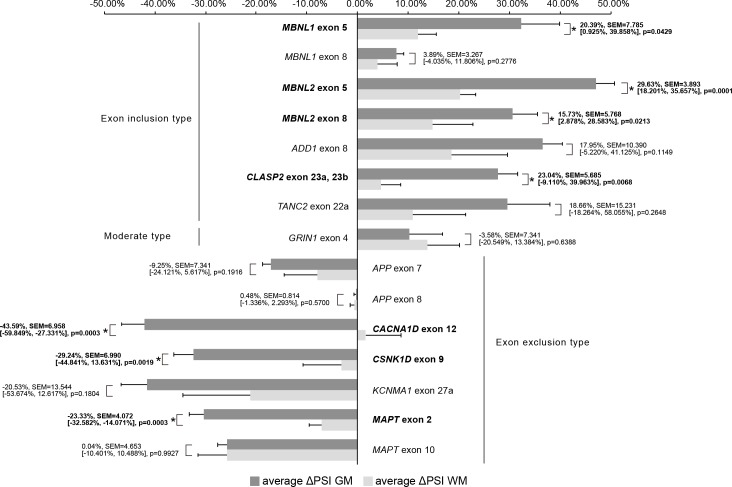
Fig 4. Comparison of ΔPSI GM and ΔPSI WM.
This bar graph shows average ΔPSI GM and average ΔPSI WM. The error bars represent SEM. Average Δ PSI values of all examined genes were compared by Welch’s T-test. The numbers in the graph indicate the mean difference, SEM, [Lower CL, Upper CL], and p-value in this order for comparison between average ΔPSI GM and average ΔPSI WM. The gene names and numbers with statistical significance were written in bold with asterisk. GM, grey matter; WM, white matter.

