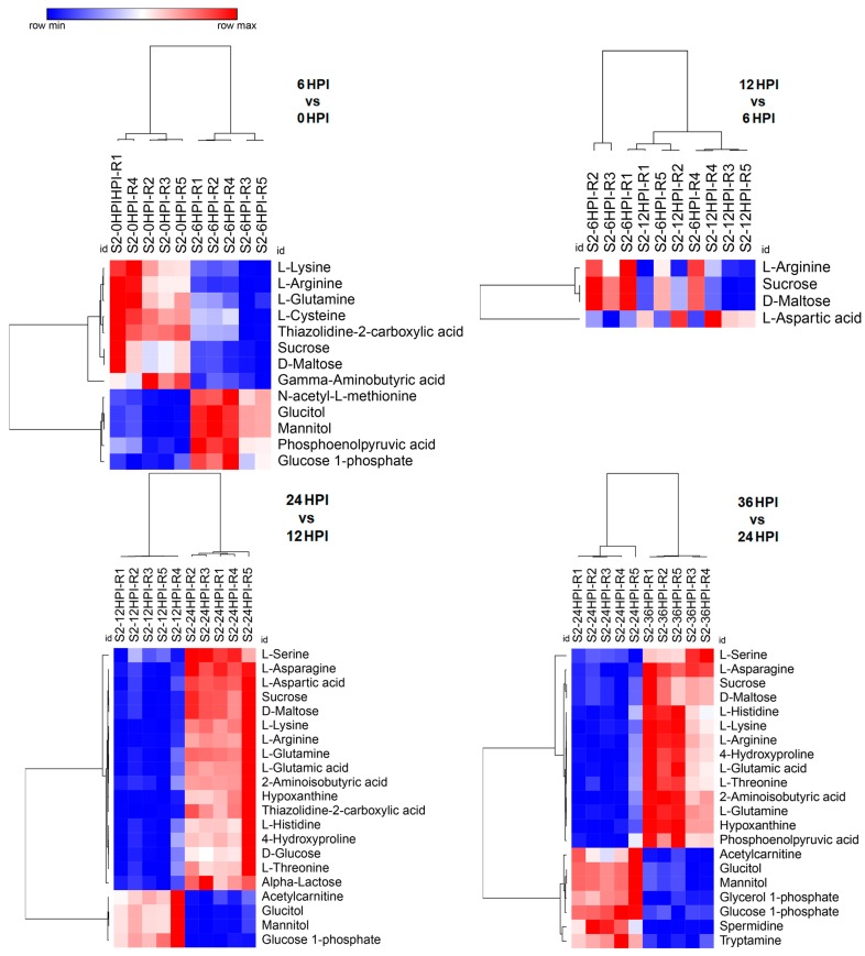
Figure 3.
Heat maps of abundance of metabolites at different time points after CrPV infection: comparison between consecutive stages of infection. Hierarchical clustering (one minus Pearson correlation) was used to separate individual samples (X-axis). The Y-axis represents individual metabolites that were identified and showed changes in abundance with respect to preceding and following time points (p < 0.05). Normalized signal intensities are visualized as a color spectrum in the heat maps. Red and blue represent high and low expression, respectively, of metabolites.

