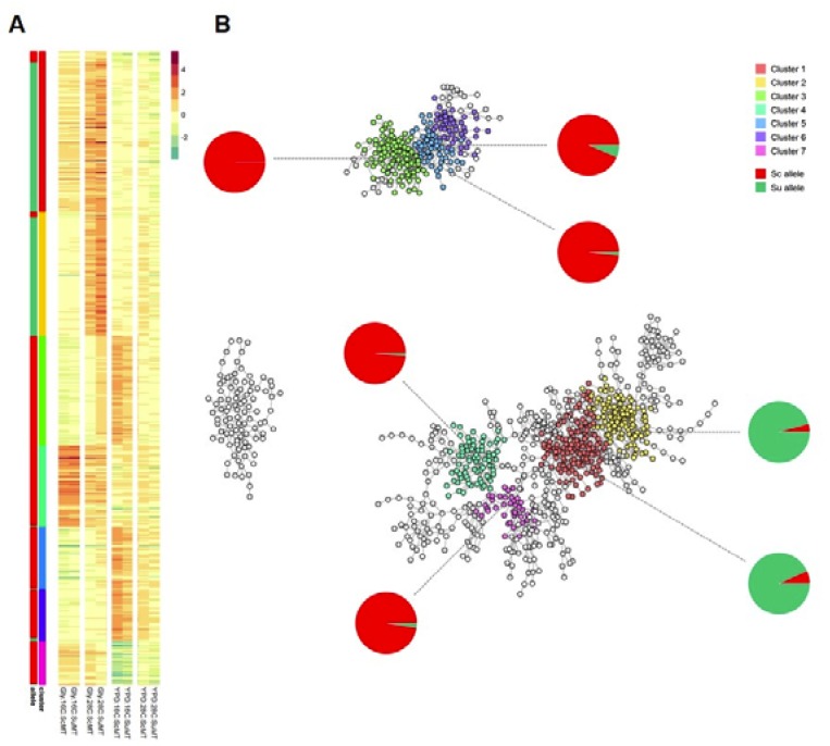
Figure 4.
Analysis of allelic co-expression. (A) Heatmap was constructed based on significant correlation between alleles (i.e., Pearson coefficient ≥ 0.98 and p-value ≤ 0.05). Rows represent alleles of different genes and columns represent conditions used in this study. Each cell represents similarity in expression profiles with respect to the parental controls. Coloured bars show clusters identified by walktrap algorithm (step size = 13), which is implemented in the R package igraph, and proportion of Sc (red) and Su (green) alleles in the clusters. (B) A graphical representation of the co-expression map. Nodes represent alleles of different genes, and edges represent similarity in expression across the four testing conditions and the two hybrids. Each cluster is complemented with a pie chart indicating the proportion of Sc (S. cerevisiae, red) and Su (S. uvarum, green) alleles.

