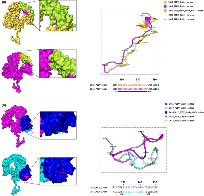
Figure 6.

Comparative analysis of the predicted S1 protein modelling among 2015–2018 PEDV strains. (a) Comparative analysis of the predicted S1 protein modelling between 2015_PEDV‐strain and 2016_PEDV‐strain. (b) The compared S1 modelling of the 2016_PEDV‐strain and 2017_PEDV‐strain. The 2015_PEDV‐strain was shown as surface and cartoon by yellow; 2016_PEDV‐strain was shown as surface and cartoon by pink; 2017_PEDV‐strain was shown as surface and cartoon by cyan. The S1‐NDT of 2016‐2017_PEDV‐strain was shown as surface by blue. The S1‐RBD 2015‐2016_PEDV‐strain was shown as surface by limon [Colour figure can be viewed at wileyonlinelibrary.com]
