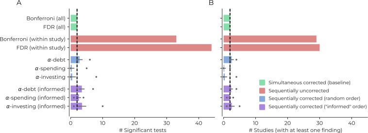
Figure 3. Demonstrating the impact of different correction procedures with a real dataset.
(A) The number of significant statistical tests (x-axis) that are possible for various correction procedures in a real dataset from the Human Connectome Project: see the main text for more details, supplementary file 1 for a list of the variables used in the analysis, and https://github.com/wiheto/datasetdecay copy archived at https://github.com/elifesciences-publications/datasetdecay for the code. (B) The potential number of publications (x-axis) that could result from the tests shown in panel A. This assumes that a publication requires a null hypothesis to be rejected in order to yield a positive finding. The dotted line shows the baseline from the two simultaneous correction procedures. Error bars show the standard deviation and circles mark min/max number of findings/studies for the sequential correction procedures with a randomly permuted test order.

