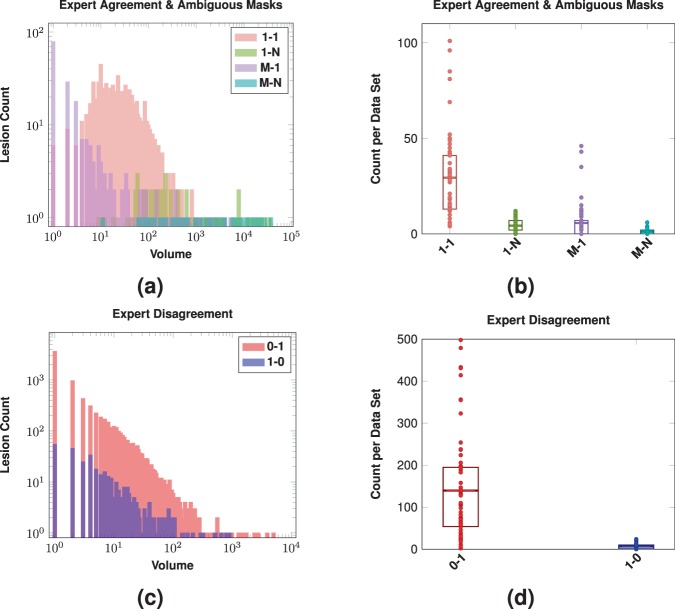
Figure 5.
Shown in (a) are log-scale histograms depicting the Expert Agreement and Ambiguous Masks for our inter-rater comparison. The histograms show the volume (-axis) and the count of lesions (-axis) of that size. The volume of the lesions is the volume assigned by Rater #2. The Expert Agreement case (1-1) shows those lesions that had a one-to-one correspondence between lesions identified by Rater #1 and #2. The Ambiguous Masks classes (1-N, M-1, and M-N) are also shown. Shown in (b) are the counts on a per data set basis for the four different Expert Agreement and Ambiguous Masks cases; a dot denotes the respective count for one of the 61 test data sets, the rectangles represent the inter quartile range (IQR), and the horizontal bars are the means. Shown in (c) are log-scale histograms depicting the two Expert Disagreement cases for our inter-rater comparison. The histograms show the volume (-axis) and the count of lesions (-axis) of that size that were identified by Rater #1 but not Rater #2 (1-0) or identified by Rater #2 but not Rater #1 (0-1). The volumes come from the rater that identified the lesion. Shown in (d) are the counts on a per data set basis for the two different Expert Disagreement cases; a dot denotes the respective count for one of the 61 test data sets, the rectangles represent the IQR, and the horizontal bars are the means.

