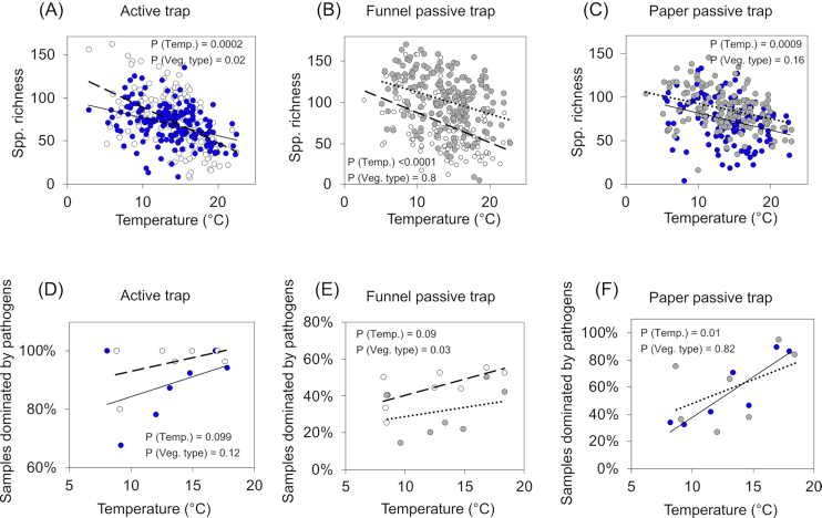
Figure 5.
Correlation between species richness (rarefied) and temperature (A–C), and between dominance of pathogens and temperature (D–F) for each type of spore trap and vegetation type. In panels (A–C), each dot corresponds to a sample. In panels (D–F), each dot corresponds to the averaged dominance of pathogens for each month of the survey. Blue dots and solid lines correspond to deciduous forests. White dots and dashed lines correspond to agricultural fields. Gray dots and dotted lines correspond to coniferous forests.

