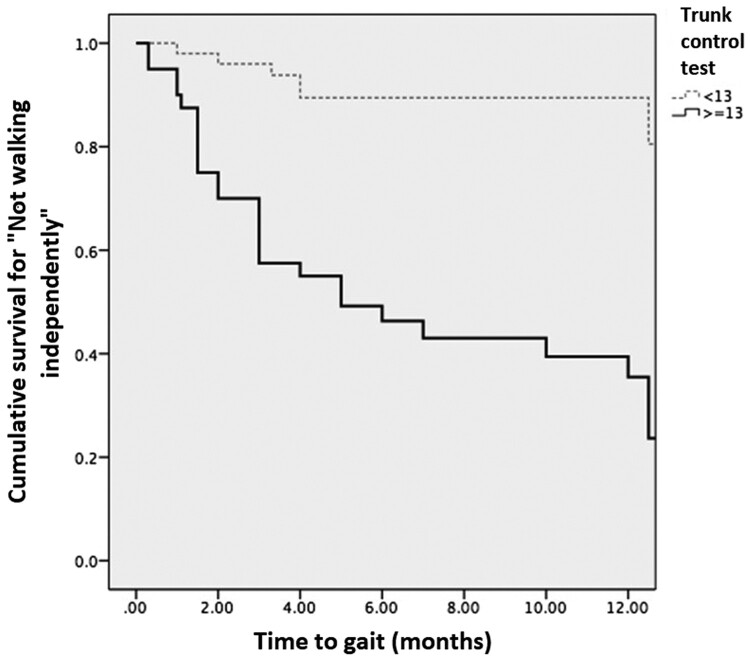
Figure 1.
Kaplan-Meier curve for gait. The light, dotted line represents individuals with poor trunk control and the thick one represents individuals with good trunk control at baseline. Since the censed event is gait, the lines show the cumulative survival “free of gait”. The two lines separate from the first month and at the end of the study, the minority of individuals with good trunk control at baseline did not walk, or, in other words, the majority of them achieved walking. In contrast, the majority of individuals in the poor control group did not walk.

