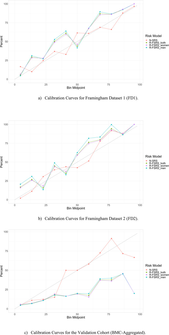
Fig 2. Calibration plots for all models on the Derivation cohort.
Fig 2A refers to the testing population of FD1 and Fig 2B to FD2. The plots show the relation between the true class of the samples and the predicted probabilities. Samples were binned to their class probabilities generated by the model. The following intervals were defined: [0,10%], (10,20%], (20,30%], … (90,100%]. The event rate for each bin was subsequently identified. For example, if 4 out of 5 samples falling into the last bin are actual events, then the event rate for that bin would be 80%. The calibration plot displays the bin mid-points on the x-axis and the event rate on the y-axis. Ideally, the event rate should be reflected as a 45° line.

