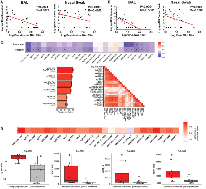
Fig. 5. Immune correlates of protection.
(A and B) Correlations of (A) pseudovirus NAb titers and (B) live NAb titers before challenge with log peak sgmRNA copies per milliliter in BAL or log peak sgmRNA copies per swab in nasal swabs after challenge. Red lines reflect the best-fit relationship between these variables. P and R values reflect two-sided Spearman rank-correlation tests. (C) The heatmap (top) shows the Spearman and Pearson correlations between antibody features and log10 peak sgmRNA copies per milliliter in BAL (*q < 0.05, **q < 0.01, ***q < 0.001 with Benjamini-Hochberg correction for multiple testing). The bar graph (bottom left) shows the rank of the Pearson correlation between cross-validated model predictions and data using the most predictive combination or individual antibody features for partial least squares regression (PLSR) and random forest regression (RFR). Error bars indicate SEs. The correlation heatmap (bottom right) represents pairwise Pearson correlations between features across all animals. (D) The heatmap (top) shows the difference in the means of the z-scored features between the completely protected and partially protected animals (**q < 0.01 with Benjamini-Hochberg correction for multiple testing). The dot plots show differences in log10 NAb titers, RBD-specific ADCD responses, S-specific ADCD responses, and RBD-specific ADCP responses between the completely protected and partially protected animals. P values indicate two-sided Mann-Whitney tests.

