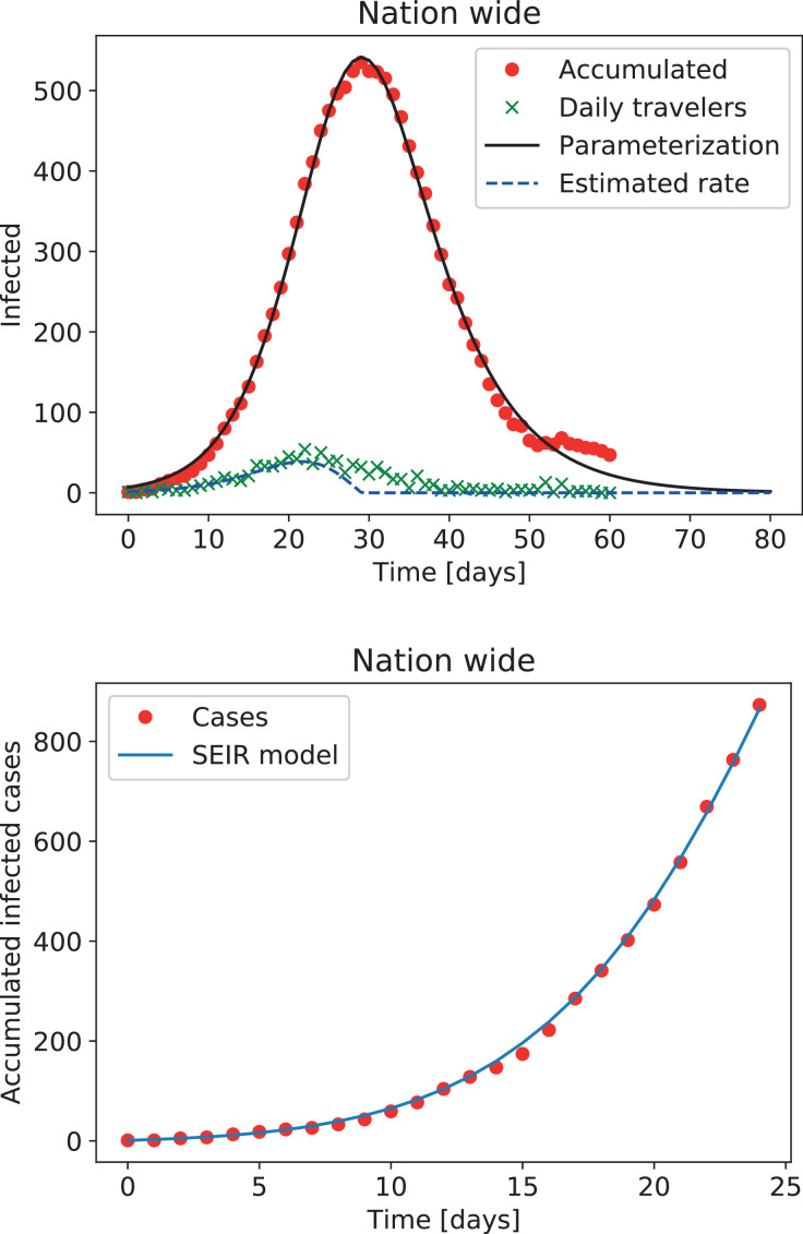
Fig. 1.
Top: Evolution of the number of reported infectious travelers arriving to Argentina since the first official case. Dots and crosses correspond to the accumulated (minus recoveries) and new per-day cases, respectively, and the solid and dashed lines represent the best fits to the data. Bottom: Number of accumulated cases in the first 25 days, and the best fit obtained using a forced deterministic SEIR model.

