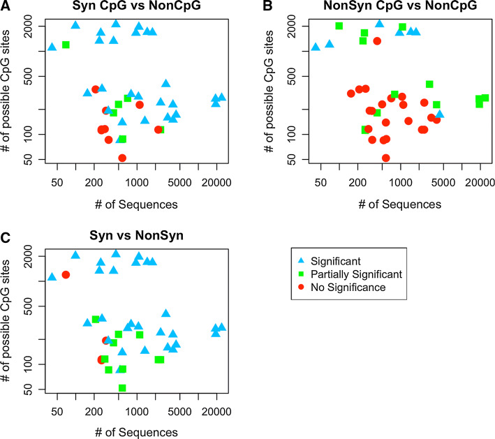
Fig. 5.
Each point represents one dataset. Its location corresponds to the amount of sequences (on the x axis) and the number of sites with CpG-creating mutations (on the y axis) for each data set. The colors and shapes represent what was found significant in each Wilcoxon test; blue triangles if both AG and TC are significant, green squares if only one was significant (partially significant) and red circles if both are not significant. We find that, in general, we are more likely to find significant effects for viruses for which we have more data (towards the top and the right)

