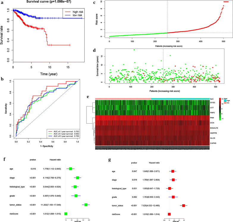
Fig. 5.
Prognostic model of the entire cohort and Risk signature with the 9 glycolysis- related hub genes. a Kaplan–Meier survival analysis of the low- and high-risk group patients in the entire cohort. b ROC curve analysis according to the 1, 3, 5-year survival of the area under the AUC value. c, d The risk scores for all patients in entire cohort are plotted in ascending order and marked as low risk (blue) or high risk (red), as divided by the threshold (vertical black line). e The distribution of risk score, survival status, and the expression of 9 genes of each patient in entire cohort by z-score, with red indicating higher expression and light blue indicating lower expression. f Univariate regression model. g Multivariate regression model

