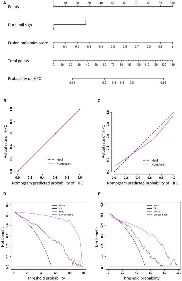
Figure 3.
Nomogram, calibration curve, and decision analysis curve. The nomogram that showed a linear presentation of the HMDT was shown in (A). The calibration curves in training and validation cohorts were shown in (B,C), respectively. Decision analysis curves in the training and validation cohorts were shown in (D,E). The y-axis represents the net benefit and the x-axis represents the threshold probability.

