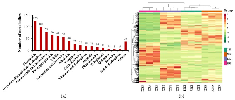
Figure 2.
(a) Classification of detected metabolites. (b) Clustering heat map of the metabolites. The metabolite content data were normalized. Each sample is represented by a column, and each metabolite is represented by a row. A red bar indicates high abundance, whereas a green bar indicates a low relative abundance (the color key scale is beside the heat map).

